新聞
News
PIE - Three Keys to Effective Branding
2013 /3 /28
Introduction
The top global brands are more adept at building and maintaining consumer loyalty by providing a complete and memorable experience while conveying key market strengths be it value, quality, reliability, etc. Most importantly, they effectively plan and execute their brand promise in a manner that is both accessible and relevant to our daily lives. How can your brand perform at its utmost potential? In the following three part series, Y&P Design will reveal the three most important factors to consider when creating your brand strategy. They will define and exemplify your brand, ultimately communicating to your consumer what differentiates your brand as being the top choice over competitors.
Part I
定位 Positioning
Maximize market value by finding the most lucrative and relevant environment for your brand to operate in. Then evaluate what distinctive positioning your brand must adopt so that your target consumer clearly understands what sets it apart from the rest.
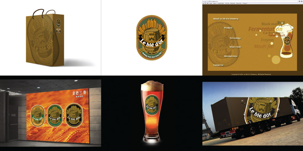
Case Study: 金色三麥 Le Ble D’or Restaurant and Brewery
When Le blé d’or approached Y&P in 2004, its plan was to just brew beers. Y&P urged the brewery however, to create European- style restaurants to “package” its beer in, so customers can enjoy Le blé d’or’s award winning beer in a fun environment accompanied by great food and friends. In this way, the beer becomes more than just a beverage; it transforms into a unique experience supported by an entire brand image. Le blé d’or is now the second most popular Taiwanese brewery, with seven successful restaurants and its fresh beer being sold in markets across the nation.

Part II
形象 Identity
Your brand identity, consisting of a unique logo, typography, graphics, and colors, is the primary agent for consumer recognition and pivotal in heightening awareness of your products and services. It is imperative to create a complete identity that is systematic and uniform, allowing it to be easily employed across any medium. It then must be frequently and correctly implemented in various applications to both promote brand consistency and ensure that customers recognize and remember your brand.
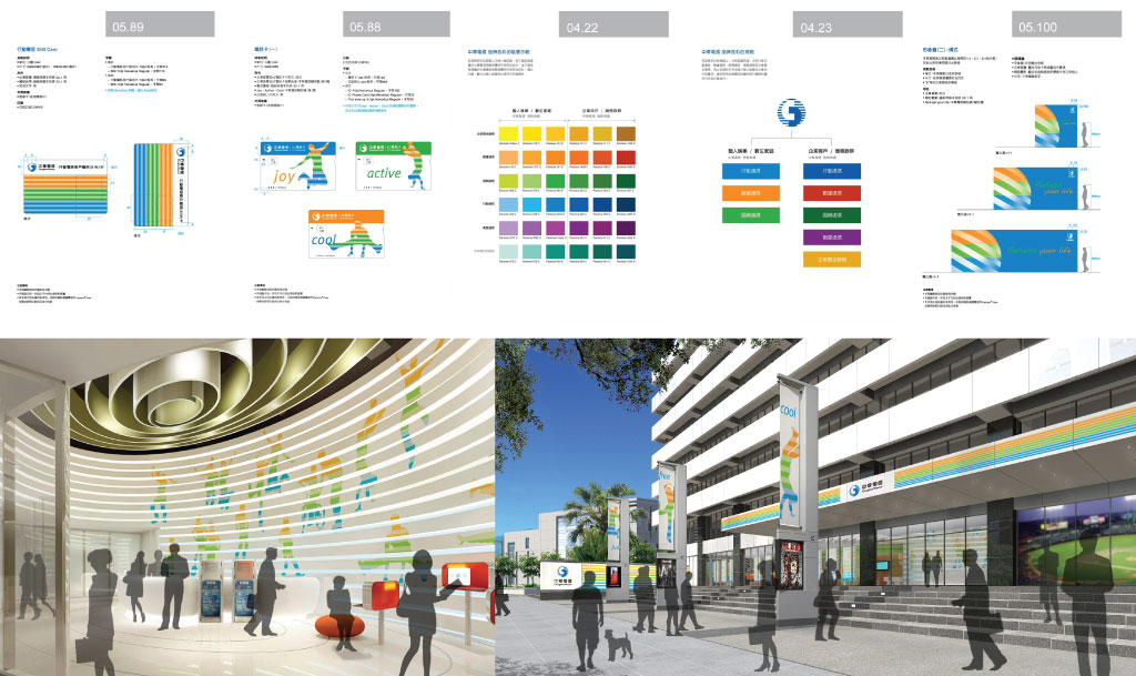
Case Study: 中華電信 Chunghwa Telecom
Chunghwa Telecom’s numerous sub-brands were originally poorly organized which negatively impacted its brand image and confused consumers and its own employees alike. Its brand identity system had also become ineffective and outdated. Y&P Design’s solution was to first restructure Chunghwa’s brand architecture, allowing us to second, revitalize its brand identity. We achieved this by creating a strict and consistent guide that Chunghwa’s sub-brands must adhere to. We then designed an entire new system of contemporary images, patterns, colors, and supplementary graphics to surround and support the logo, utilizing them in multiple applications from signage and posters to interior design and even USB key chains. With its new clearly defined brand architecture and rejuvenated brand identity, Chunghwa is now able to operate more efficiently, portraying to consumers what services each of its sub-brands provide and presenting a memorable and professional brand identity.

Part III
情感 Emotional Connection
Focus on developing and maintaining a strong emotional connection with your brand’s target audience. Communicate that your brand’s priority is strengthening that bond by providing products and services that directly cater toward those specific emotions, be it happiness, sensuality, desire, trust, caution, confidence, etc. Built and developed from customer experience, brand identity, people, and advertising, these intangible aspects are as important to brand management as tangible products and services and will give your consumers real purpose to support your brand.
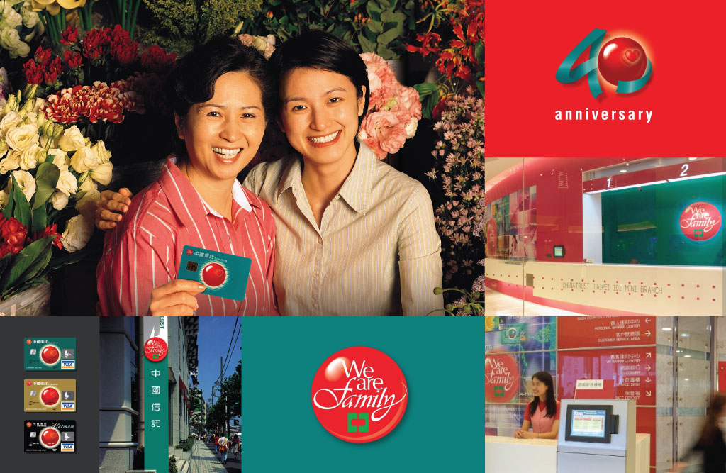
Case Study #3: 中過信託 Chinatrust
Y&P wanted to create a brand for Chinatrust bank that could really connect with its customers. With this goal in mind, we presented to Chinatrust the unconventional idea that a bank should be more than just a financial institution: it can become a friendly service that people would want to rely on. From this philosophy of treating clients as family, Y&P helped develop the slogan “We are Family” and created a brand image that utilizes the warm, comforting colors of Christmas. With this commitment to its customers, Chinatrust has established a connection of security and sincerity that their patrons enjoy every day.

© 元平設計有限公司 Y&P Design International Inc.